Implementing Dark Mode with Tailwind CSS v4 and next-themes
Dec 13, 2024
Introduction
In this guide, I’ll walk you through converting the default create-next-app generated project into a project using Tailwind CSS v4 Beta and implementing a custom dark mode using the next-themes package for manual theme switching.

Step 1: Setting Up the Next.js Project
Initialize a new Next.js project with the latest Next.js (v15.1.0) project template:
npx create-next-app@latest my-blog
✔ Would you like to use TypeScript? … Yes
✔ Would you like to use ESLint? … Yes
✔ Would you like to use Tailwind CSS? … Yes
✔ Would you like your code inside a `src/` directory? … No
✔ Would you like to use App Router? (recommended) … Yes
✔ Would you like to use Turbopack for `next dev`? … Yes
✔ Would you like to customize the import alias (`@/*` by default)? … No
Since the default Tailwind CSS version included is stable, I opted to use the latest beta version by specifying @next. Additionally, install the necessary PostCSS plugins:
npm install -D tailwindcss@next @tailwindcss/postcss@next postcss@latestFinally, install the next-themes package to support theme switching in your Next.js application:
npm install next-themesStep 2: Configuring PostCSS for Tailwind CSS
Modify postcss.config.mjs to use the Tailwind PostCSS plugin (@tailwindcss/postcss) for Tailwind CSS v4:
/** @type {import('postcss-load-config').Config} */
export default {
  plugins: {
    '@tailwindcss/postcss': {},
  },
};
Step 3: Configuring Tailwind CSS
With Tailwind CSS v4.0, configuration shifts from JavaScript to CSS. You can remove the tailwind.config.ts file. Instead, import Tailwind into globals.css:
@import "tailwindcss";Step 4: Customizing Dark Mode in globals.css
For the next-themes package to handle dark mode, create a custom variant in Tailwind. Add this to globals.css:
@import "tailwindcss";
@variant dark (&:where([data-theme="dark"] *));

/* Commented out existing dark mode implementation */
/*
:root {
  --background: #ffffff;
  --foreground: #171717;
}

@media (prefers-color-scheme: dark) {
  :root {
    --background: #0a0a0a;
    --foreground: #ededed;
  }
}

body {
  color: var(--foreground);
  background: var(--background);
  font-family: Arial, Helvetica, sans-serif;
}
*/
Step 5: Applying Dark Mode in Layout and Pages
Updating layout.tsx
Wrap the children components with the ThemeProvider from next-themes in layout.tsx:
import type { Metadata } from "next";
import { Geist, Geist_Mono } from "next/font/google";
import "./globals.css";
import { ThemeProvider } from "next-themes";

const geistSans = Geist({
  variable: "--font-geist-sans",
  subsets: ["latin"],
});

const geistMono = Geist_Mono({
  variable: "--font-geist-mono",
  subsets: ["latin"],
});

export const metadata: Metadata = {
  title: "Create Next App",
  description: "Generated by create next app",
};

export default function RootLayout({
  children,
}: Readonly<{
  children: React.ReactNode;
}>) {
  return (
    <html lang="en" suppressHydrationWarning>
      <body
        className={`${geistSans.variable} ${geistMono.variable} antialiased`}
      >
        <ThemeProvider attribute="data-theme">{children}</ThemeProvider>
      </body>
    </html>
  );
}
Adding Dark Mode Toggle in page.tsx
Add a button to toggle the dark mode in page.tsx. This button toggles the data-theme attribute between light and dark:
import Image from "next/image";
import ThemeSwitcher from "./theme-switcher";

export default function Home() {
  return (
    <div className="grid grid-rows-[20px_1fr_20px] items-center justify-items-center min-h-screen p-8 pb-20 gap-16 sm:p-20 font-[family-name:var(--font-geist-sans)] bg-white dark:bg-black text-black dark:text-white">
      <main className="flex flex-col gap-8 row-start-2 items-center sm:items-start">
        <Image
          className="dark:invert"
          src="/next.svg"
          alt="Next.js logo"
          width={180}
          height={38}
          priority
        />
        <ThemeSwitcher />
      </main>
    </div>
  );
}
Creating the ThemeSwitcher Component
The ThemeSwitcher component toggles between light and dark themes and ensures no React hydration errors by rendering only after mounting:
"use client";
import { useEffect, useState } from "react";
import type { NextPage } from "next";
import { useTheme } from "next-themes";

const ThemeSwitcher: NextPage = () => {
  const { resolvedTheme, setTheme } = useTheme();
  const [mounted, setMounted] = useState(false);

  useEffect(() => setMounted(true), []);

  if (!mounted) return null;

  const IconText = resolvedTheme === "light" ? "LIGHT" : "DARK";

  return (
    <button
      type="button"
      aria-label="Theme Switcher"
      onClick={() => setTheme(resolvedTheme === "light" ? "dark" : "light")}
      className="flex items-center outline-none rounded text-slate-600 hover:bg-slate-600 hover:text-white dark:text-white dark:hover:bg-slate-200 dark:hover:text-black"
    >
      {IconText}
    </button>
  );
};

export default ThemeSwitcher;
Step 6: Running the Application
To run the application locally:
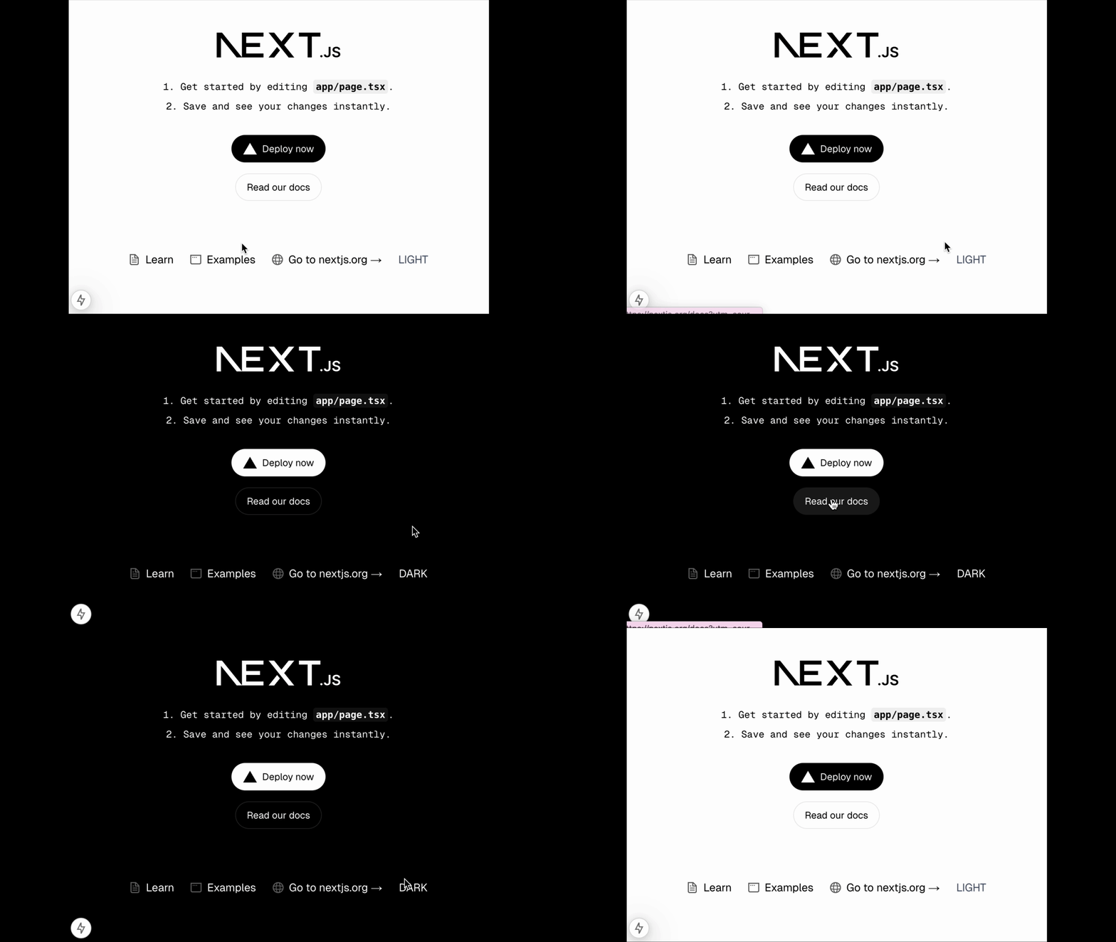
npm run devGoto https://localhost:3000 to toggle the light/dark mode by clicking the button in the footer.
Challenges Faced
1. React Hydration Error
Avoided this error by using a mounted state in the ThemeSwitcher component. Learn more here.
2. Limited Resources on Tailwind CSS v4 Beta
Few resources discuss Tailwind CSS v4.0 and manual theme switching with next-themes. Existing articles were either outdated or incorrect.
This guide aims to address those gaps.
Conclusion
You can find the complete source code for this project on jianliao/my-blog. If you want to learn more about Tailwind CSS v4 Beta, feel free to checkout my personal blog repo jianliao/jianliao.github.io, I showcase not only the content in this article but also a fully functional MDX authoring experience with syntax highlighting, LaTeX math rendering, and more.